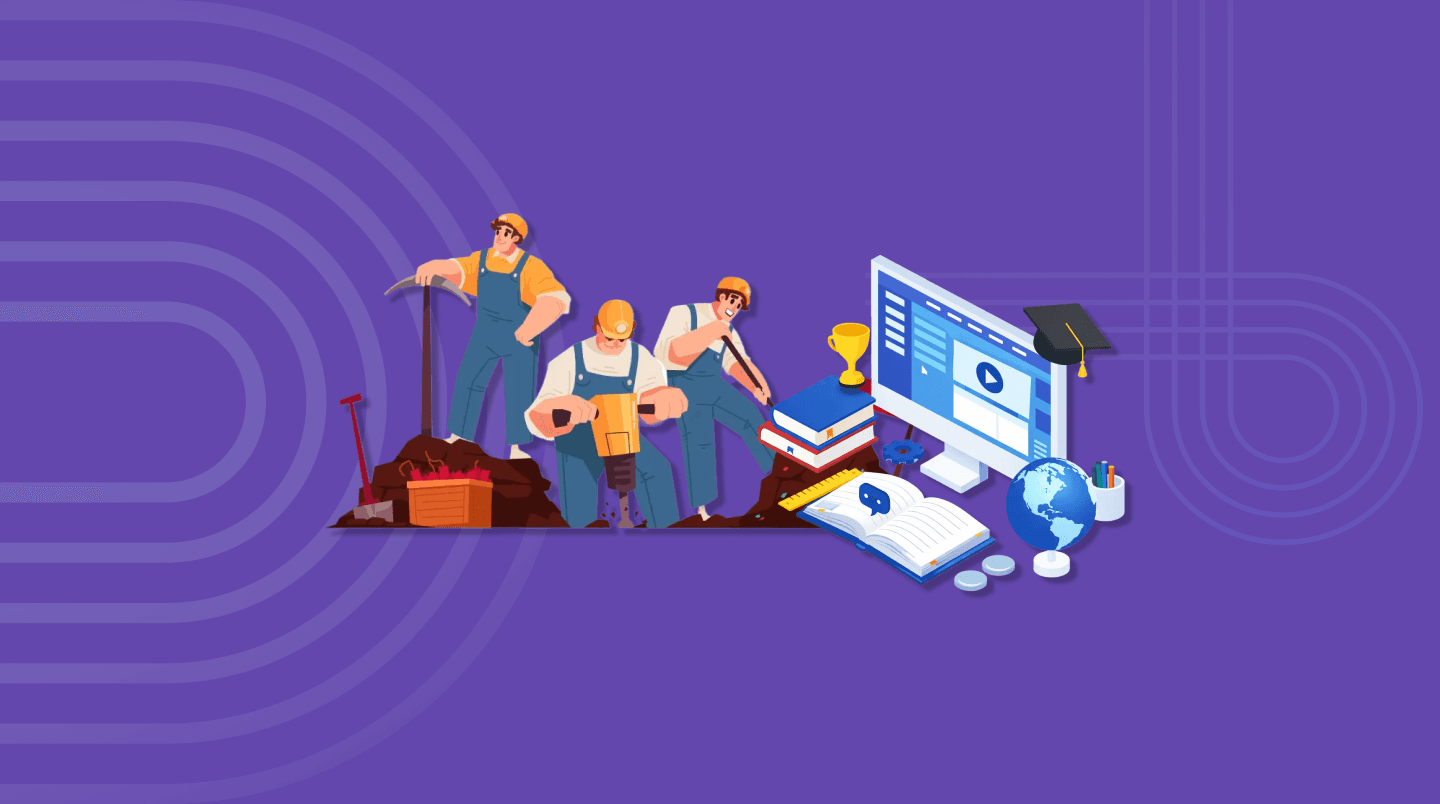
Training Engagement Platform Redesign
Training Engagement Platform Redesign
Training Engagement Platform Redesign
Frictionless Learning Journey
Frictionless Learning Journey
YEAR
2025
DURATION
6 months
DURATION
6 months
INDUSTRY
Mining
PLATFORM
SAP Enable Now
PRODUCT TYPE
B2E (Employee Experience)
TOOLS
Figma, Balsamiq
TEAM
Self-initiated
MY ROLE
Senior UX Consultant
TEAM
Self-initiated
MY ROLE
Senior UX Consultant
MY ROLE
Senior UX Consultant
PROJECT OVERVIEW
PRODUCT TYPE
B2E (Employee Experience)
TOOLS
Figma, Balsamiq
TEAM
Self-initiated
MY ROLE
Senior UX Consultant
The Problem Statement
The organisation had a training platform in place, but it was not performing as intended. Employees, whether office-based or working remotely, were struggling to locate the right modules, losing their progress mid-session, and were unclear on what they were actually required to complete. Drop-off rates were high, completion rates were low, and there was little confidence among employees that they were meeting their compliance obligations.
What I Set Out to Do?
I returned to first principles and asked a straightforward question: What does an employee genuinely need when they sit down to complete their training? They need immediate clarity on what is required of them, a frictionless path through the content, and confidence at the end that they have fulfilled their obligations.
With that in mind, I undertook a full redesign of the learning journey, from the moment an employee accesses the platform through to module completion, ensuring the experience worked equally well for both office-based and remote workers.
What I changed?
I began with discovery. Rather than requiring employees to navigate complex menus to determine which training applied to them, I restructured the experience to surface that information immediately, what is required, how much remains, and where to begin. The guesswork was removed entirely.
I then focused on the completion experience, addressing the mid-module friction that was contributing to drop-off. This involved simplifying the interface, resolving navigation inconsistencies, and ensuring employees could reliably resume interrupted sessions without losing their progress.
The Outcome
The redesign produced a measurably improved experience: completion rates increased, mid-module drop-off decreased, and employees finished their training with genuine confidence that they had met their compliance requirements, rather than uncertainty about whether they had done enough.
Business Goals & Challenges
Business Goals | Key Challenges/Constraints |
|---|---|
|
|
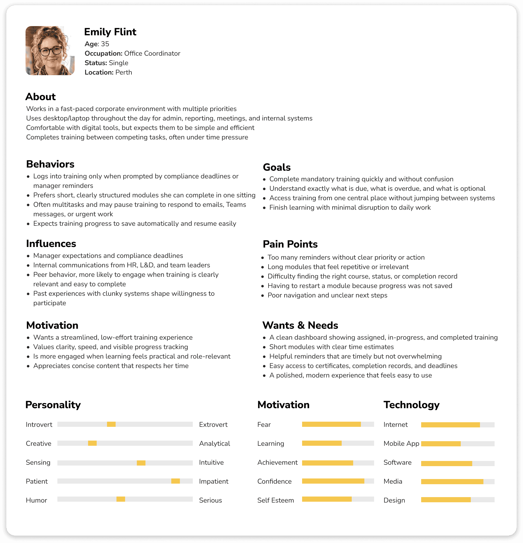
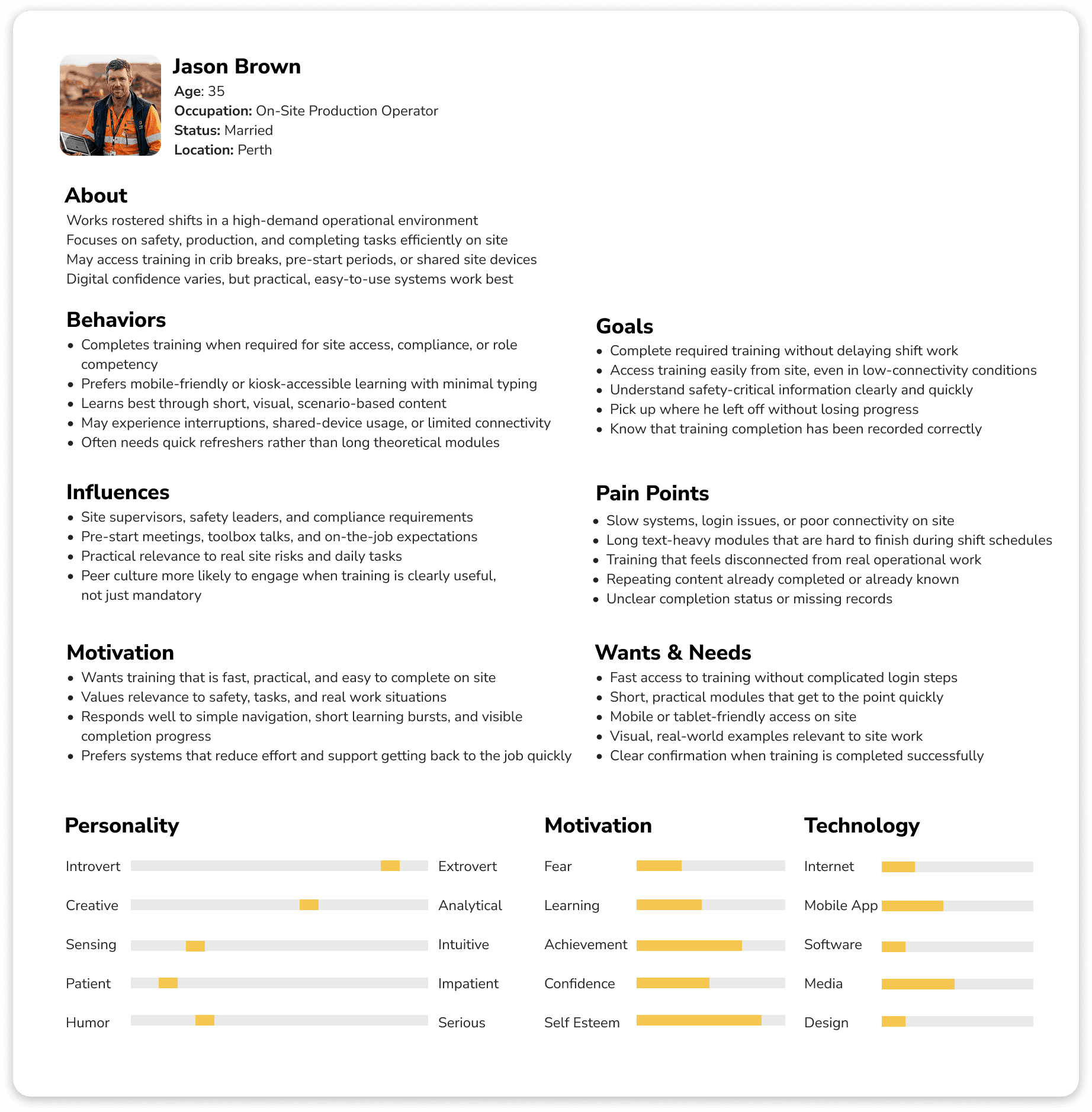
Target Audience
corporate office staff (Head Office / Perth)
mine site operations teams (FIFO/DIDO)
Success Metrics
Completion & compliance | Engagement |
|---|---|
↑ completion rate ↓ overdue volume ↑ first-attempt completion (fewer restarts) | ↑ active engagement ↑ return rate for multi-part modules |
Efficiency | Business impact |
↓ time-to-start & time-to-complete training ↓ drop-off ↓ support tickets | ↓ incidents linked to training gaps ↓ time-to-competency ↑ audit readiness |
UX & accessibility | Learning effectiveness |
↑ customer satisfaction, ease-of-use, ↑ task success rate | ↑ pass rate ↓ repeat attempts |
The Problem Statement
The organisation had a training platform in place, but it was not performing as intended. Employees, whether office-based or working remotely, were struggling to locate the right modules, losing their progress mid-session, and were unclear on what they were actually required to complete. Drop-off rates were high, completion rates were low, and there was little confidence among employees that they were meeting their compliance obligations.
What I Set Out to Do?
I returned to first principles and asked a straightforward question: What does an employee genuinely need when they sit down to complete their training? They need immediate clarity on what is required of them, a frictionless path through the content, and confidence at the end that they have fulfilled their obligations.
With that in mind, I undertook a full redesign of the learning journey, from the moment an employee accesses the platform through to module completion, ensuring the experience worked equally well for both office-based and remote workers.
What I changed?
I began with discovery. Rather than requiring employees to navigate complex menus to determine which training applied to them, I restructured the experience to surface that information immediately, what is required, how much remains, and where to begin. The guesswork was removed entirely.
I then focused on the completion experience, addressing the mid-module friction that was contributing to drop-off. This involved simplifying the interface, resolving navigation inconsistencies, and ensuring employees could reliably resume interrupted sessions without losing their progress.
The Outcome
The redesign produced a measurably improved experience: completion rates increased, mid-module drop-off decreased, and employees finished their training with genuine confidence that they had met their compliance requirements, rather than uncertainty about whether they had done enough.
Business Goals & Challenges
Business Goals | Key Challenges/Constraints |
|---|---|
|
|
Target Audience
corporate office staff (Head Office / Perth)
mine site operations teams (FIFO/DIDO)
Success Metrics
Completion & compliance | Engagement |
|---|---|
↑ completion rate ↓ overdue volume ↑ first-attempt completion (fewer restarts) | ↑ active engagement ↑ return rate for multi-part modules |
Efficiency | Business impact |
↓ time-to-start & time-to-complete training ↓ drop-off ↓ support tickets | ↓ incidents linked to training gaps ↓ time-to-competency ↑ audit readiness |
UX & accessibility | Learning effectiveness |
↑ customer satisfaction, ease-of-use, ↑ task success rate | ↑ pass rate ↓ repeat attempts |
PRODUCT TYPE
B2E (Employee Experience)
TOOLS
Figma, Balsamiq
TEAM
Self-initiated
MY ROLE
Senior UX Consultant
IMPACT
IMPACT
If implemented, the Enterprise Training Engagement Platform could,
|
|
| ||||||
|
|
|


If implemented, the Enterprise Training Engagement Platform could,
|
|
| ||||||
|
|
|
PROJECT OVERVIEW
The Problem Statement
The organisation had a training platform in place, but it was not performing as intended. Employees, whether office-based or working remotely, were struggling to locate the right modules, losing their progress mid-session, and were unclear on what they were actually required to complete. Drop-off rates were high, completion rates were low, and there was little confidence among employees that they were meeting their compliance obligations.
What I Set Out to Do?
I returned to first principles and asked a straightforward question: What does an employee genuinely need when they sit down to complete their training? They need immediate clarity on what is required of them, a frictionless path through the content, and confidence at the end that they have fulfilled their obligations.
With that in mind, I undertook a full redesign of the learning journey, from the moment an employee accesses the platform through to module completion, ensuring the experience worked equally well for both office-based and remote workers.
What I changed?
I began with discovery. Rather than requiring employees to navigate complex menus to determine which training applied to them, I restructured the experience to surface that information immediately, what is required, how much remains, and where to begin. The guesswork was removed entirely.
I then focused on the completion experience, addressing the mid-module friction that was contributing to drop-off. This involved simplifying the interface, resolving navigation inconsistencies, and ensuring employees could reliably resume interrupted sessions without losing their progress.
The Outcome
The redesign produced a measurably improved experience: completion rates increased, mid-module drop-off decreased, and employees finished their training with genuine confidence that they had met their compliance requirements, rather than uncertainty about whether they had done enough.
Business Goals & Challenges
Business Goals | Key Challenges/Constraints |
|---|---|
|
|
Target Audience
corporate office staff (Head Office / Perth)
mine site operations teams (FIFO/DIDO)
Success Metrics
Completion & compliance | Engagement |
|---|---|
↑ completion rate ↓ overdue volume ↑ first-attempt completion (fewer restarts) | ↑ active engagement ↑ return rate for multi-part modules |
Efficiency | Business impact |
↓ time-to-start & time-to-complete training ↓ drop-off ↓ support tickets | ↓ incidents linked to training gaps ↓ time-to-competency ↑ audit readiness |
UX & accessibility | Learning effectiveness |
↑ customer satisfaction, ease-of-use, ↑ task success rate | ↑ pass rate ↓ repeat attempts |
IMPACT
If implemented, the Enterprise Training Engagement Platform could,
|
|
| ||||||
|
|
|
RESEARCH
The research aimed to uncover user needs, identify barriers to completion, and understand the environmental constraints shaping how employees engage with training, across both office and mine-site teams, in order to inform a simpler, faster, and more effective learning experience.
To achieve this, I employed a mixed-method research approach that combined direct user feedback, observed task behaviour, and operational data.
This allowed me to develop a well-rounded understanding of both the usability and reliability issues affecting the platform, as well as the compliance implications that followed from them.
Research Method | Purpose + Impact Supported | Actions Performed |
|---|---|---|
User Interviews (Employees) | Purpose: Understand real problems in completing training Impact Supported: completion, ease of use, retention, and low connectivity | Qualitative Research Ran 30–45 minute 1:1 interviews (in-person/Teams/phone) using a semi-structured question guide. Quantitative Research Sent a short 5–10 minute online survey to 50 employees across the office and mine sites. |
Usability Testing - SAP Enable Now (Current Platform) | Purpose: See where users struggle in the training flow Impact Supported: time-to-start, time-to-complete, ease of use, completion | Measured:
|
SAP Enable Now / Analytics Review | Purpose: Validate issues with real usage data Impact Supported: completion, compliance, time, retention | Reviewed:
|
Support Ticket / Admin Feedback Review | Purpose: Identify repeated problems and administrative burdens. Impact Supported: admin effort, operational cost, reliability | Looked for:
|
Content Review with SMEs (Modules + Assessments) | Purpose: Check if the training content is too long, unclear, or hard to follow Impact Supported: retention, competency, ease of use, completion | Reviewed:
|
User personas
Qualitative & Quantitative Research Questionnaires
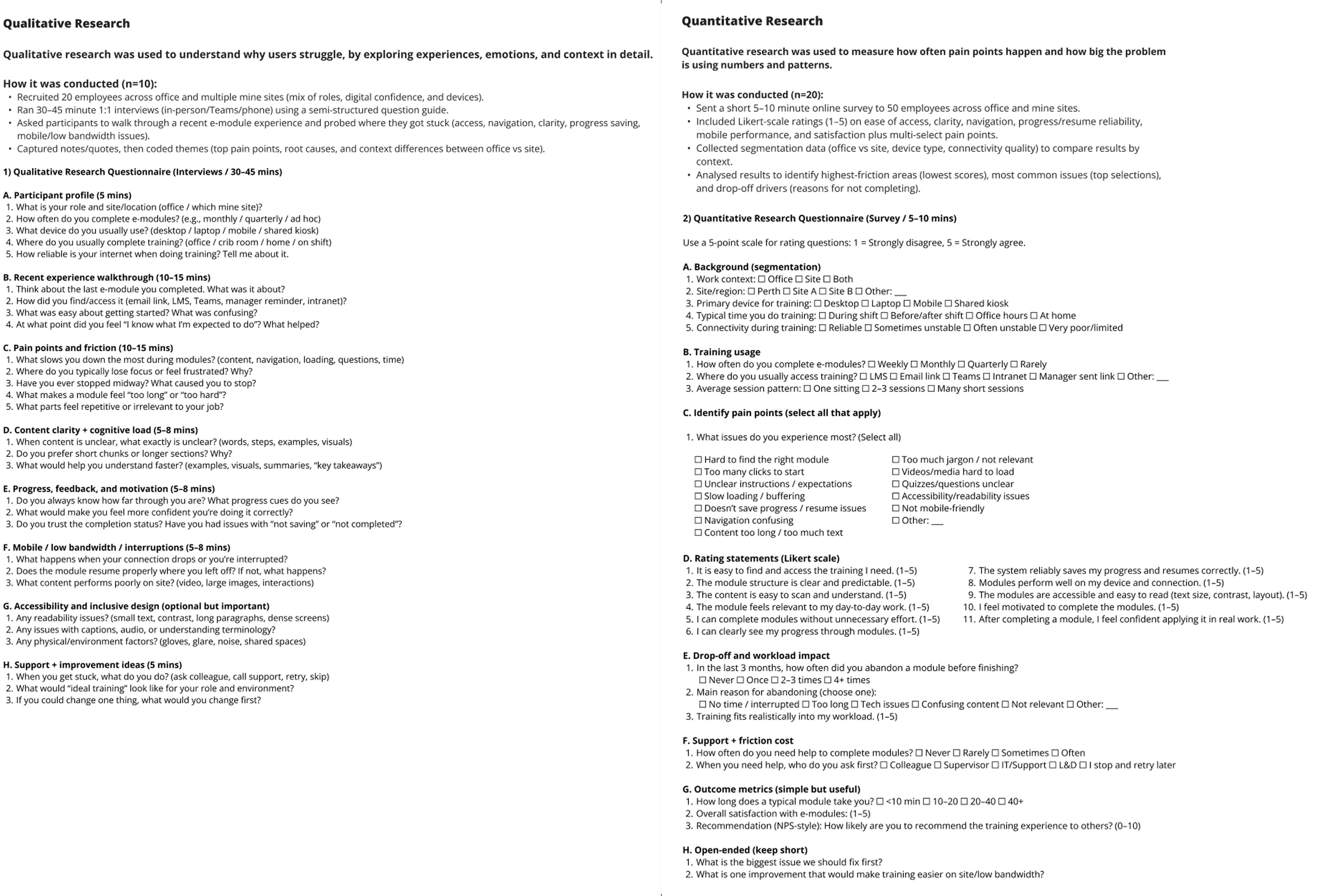
User Journey
INSIGHTS
Key Findings
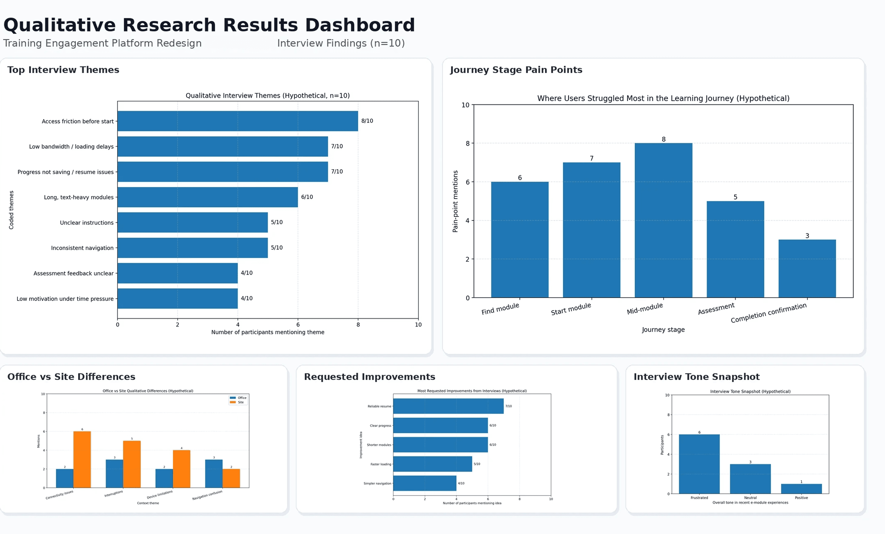
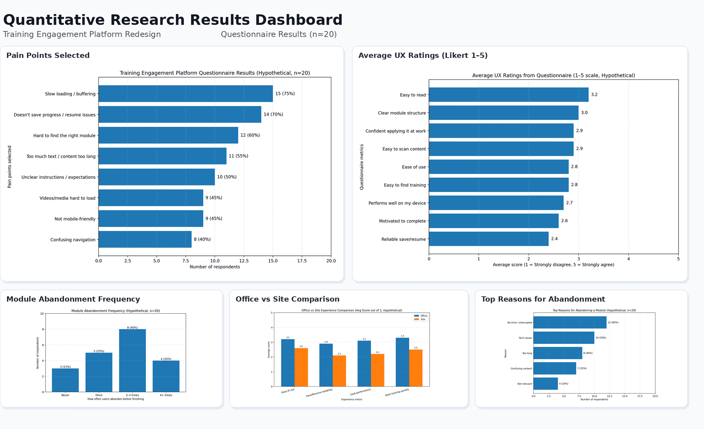
Across both qualitative interviews (n=10) and quantitative questionnaires (n=20), friction was present at nearly every stage of the learning journey.
The most reported pain points were slow loading (75%), progress not saving or resuming correctly (70%), and difficulty finding the right module (60%).
UX ratings were below average across all measures, with reliable save/resume scoring the lowest at 2.4 and motivation to complete at 2.6. Mid-module was identified as the most painful point in the journey, and mine-site employees consistently reported a worse experience than their office-based counterparts.
Opportunity Areas
Opportunity | Insight | Design Direction |
|---|---|---|
Fix reliability first | Save/resume and loading were the lowest-rated issues across both methods | Prioritise technical performance before interface changes |
Simplify module discovery | 60% of users struggled to find their required training | Surface role-relevant modules immediately, without navigation |
Reduce mid-module drop-off | The mid-module was the highest drop-off point in the journey | Shorter segments, clearer progress indicators, scannable layouts |
Design for the mine-site | Site employees faced compounded connectivity and device challenges | Build an experience that accounts for low-bandwidth and mobile constraints |
Close the loop on completion | Low scores on motivation and compliance confidence | Design a deliberate, affirming completion state |
DESIGN PROCESS
With research findings and usability insights in hand, I moved into ideation with a clear brief: design a learning experience that is immediate, reliable, and confidence-building for both office and mine-site employees.
Concepts Explored
Concept | Description | Progressed |
|---|---|---|
Personalised training dashboard | A role-based home screen surfacing only required modules, ordered by urgency | ✓ |
Persistent progress bar | A fixed, always-visible indicator of overall compliance completion across the platform | ✓ |
Offline mode for mine-site | Downloadable modules accessible without connectivity, syncing on reconnection | Partial - flagged for future sprint |
Micro-module format | Breaking long modules into short, completable segments with individual save points | ✓ |
Contextual save confirmation | A subtle, persistent indicator confirming progress has been saved after every interaction | ✓ |
Completion summary screen | A post-module screen summarising what was completed, with a compliance status confirmation | ✓ |
Gamified progress tracking | Badges and streaks to drive motivation and return visits | ✗ deprioritised as misaligned with compliance context |
Manager visibility dashboard | A view for team leads to monitor compliance status across their team | ✗ out of scope for this phase |
Wireframes
Designing for Accessibility
Accessibility improvements focused on readability, keyboard and screen reader support, clearer interactions, and low-connectivity resilience to create a more inclusive and reliable learning experience for both office and remote users.
Improvement | Why It Matters | Expected Impact |
|---|---|---|
Improve text readability (font size, contrast, spacing, shorter paragraphs) | Makes content easier to read and reduces fatigue | Better comprehension, less cognitive load, improved completion |
Clear heading structure (H1, H2, H3) | Helps users scan content and understand page structure | Faster navigation, better usability, stronger content clarity |
Clear action labels (e.g., Start Module, Continue Training) | Removes ambiguity and makes tasks easier to understand | Quicker decisions, better ease of use |
Screen reader-friendly labels (buttons, forms, status messages) | Ensures assistive tech users can understand and use the platform | Better accessibility for screen reader users |
Accessible assessments and forms | Makes quizzes easier to complete and reduces avoidable errors | Higher assessment completion, less frustration |
Clear error messages with guidance | Helps users recover quickly when something goes wrong | Fewer drop-offs, faster recovery from errors |
Plain language and consistent terminology | Improves understanding across different literacy/digital confidence levels | Better comprehension, easier learning experience |
Applying Psychological Principles
Psychological Principle | How Applied | UX Example | Expected Impact |
|---|---|---|---|
Goal-Gradient Effect | Made progress visible to motivate users to continue and finish | Progress bar, section count, milestone messages, time remaining | Higher completion rates, better engagement |
Cognitive Load Theory | Reduced mental effort by simplifying and chunking content | Shorter sections, clear headings, smaller content blocks, less clutter | Better comprehension, lower drop-off, improved retention |
Recognition Over Recall | Reduced memory load with familiar patterns and visible options | Clear labels (Start/Continue), consistent navigation, visible resume options | Faster task completion, fewer errors, better usability |
Feedback Loop Principle | Provided immediate system and learning feedback | “Progress saved” confirmation, loading states, quiz feedback, clear error messages | More confidence, less frustration, better learning outcomes |
SOLUTION
The redesign was shaped by established UX laws and principles. These principles helped guide decisions to simplify the learning journey, reduce cognitive load, improve familiarity and clarity, and make progress more visible throughout the experience.
As a result, the solution was designed to reduce friction, support reliable use in low-connectivity environments, enhance learning clarity, and improve training completion for both head office employees and remote site-based teams.
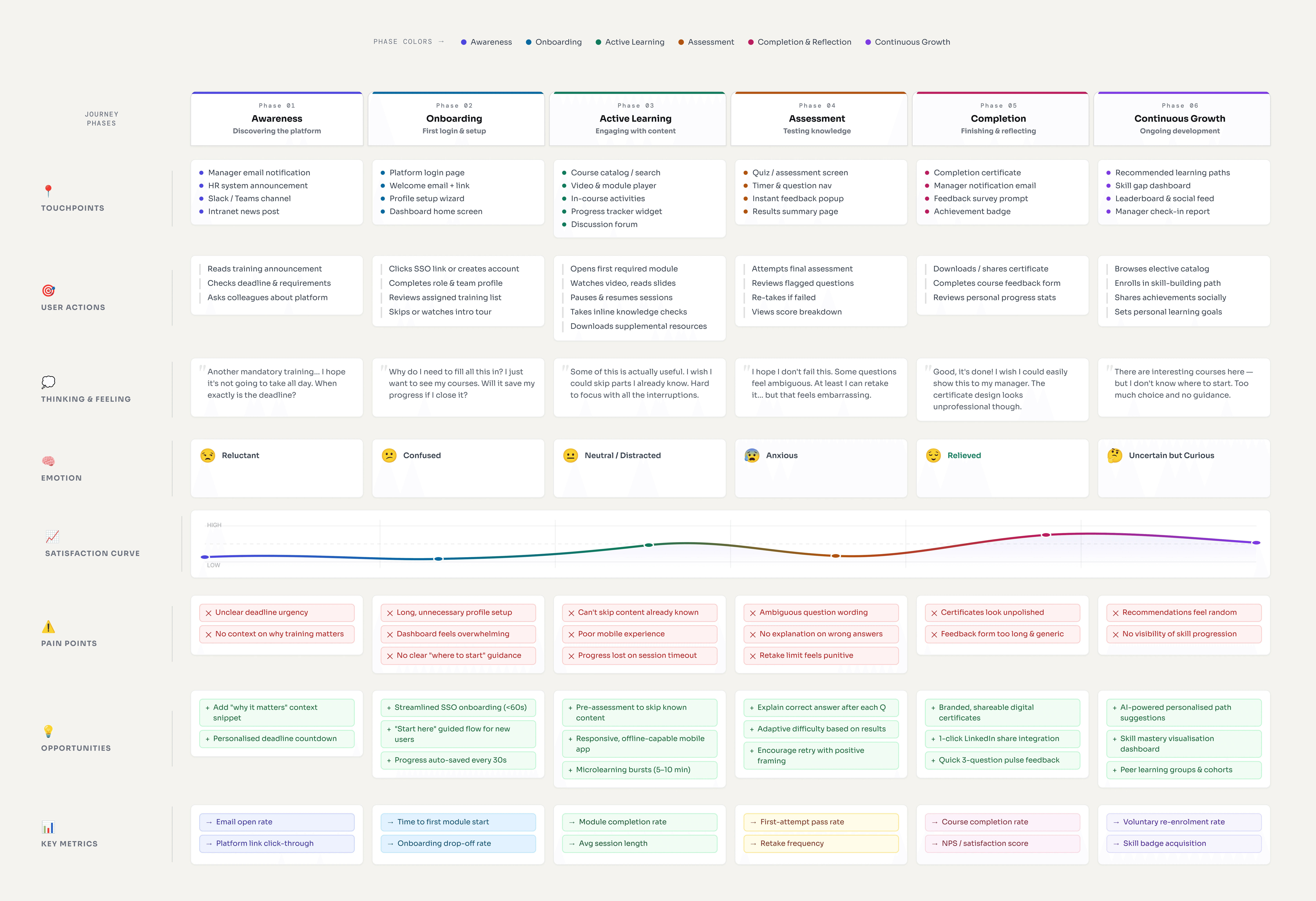
End-to-end Journey
Design Decisions
Screen: Navigation
Applied UX Law | Where Applied | UI Example | Expected Impact |
|---|---|---|---|
Hick’s Law | Dashboard and training home | Prioritised required training and reduced competing options | Faster decisions, quicker start, improved completion |
Miller’s Law | Module content structure | Broke long content into smaller sections (microlearning) | Reduced cognitive load, better retention |
Serial Position Effect | Learning content structure | Key messages placed at section starts and summaries | Improved recall of important information |
Screen: Start
Applied UX Law | Where Applied | UI Example | Expected Impact |
|---|---|---|---|
Progressive Disclosure | Content and help information | Showed only key content first, with extra details on demand | Cleaner screens, less overwhelm |
Aesthetic–Usability Effect | Visual design and layout | Clear hierarchy, consistent spacing, readable typography | Better perceived usability, higher confidence |
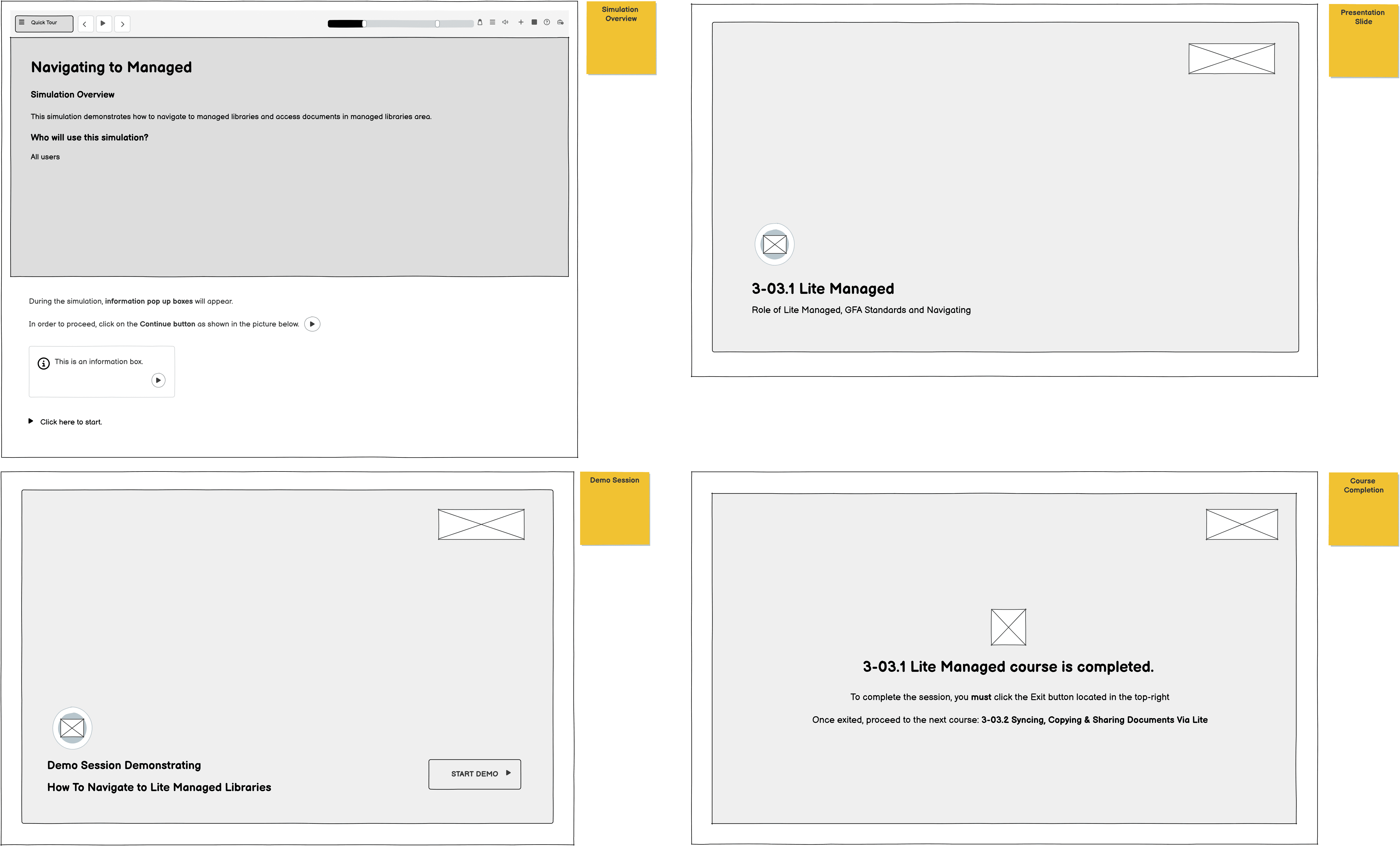
Screen: Start Module

Screen: Start Demo

UX Law | Where Applied | UI Example | Expected Impact |
|---|---|---|---|
Jakob’s Law | Module navigation and overall flow | Familiar labels and patterns (Start, Continue, Next, Submit) | Lower learning curve, improved ease of use |
Screen: Content

UX Law | Where Applied | UI Example | Expected Impact |
|---|---|---|---|
Aesthetic–Usability Effect | Visual design and layout | Clear hierarchy, consistent spacing, readable typography | Better perceived usability, higher confidence |
Screen: Content

Screen: Completion

UX Law | Where Applied | UI Example | Expected Impact |
|---|---|---|---|
Doherty Threshold | Performance and feedback states | Lightweight pages, loading indicators, quick save feedback | Better engagement, fewer drop-offs |
Peak-End Rule | Assessment and completion moments | Clear completion confirmation, summary, and next steps | Better final impression, stronger confidence |
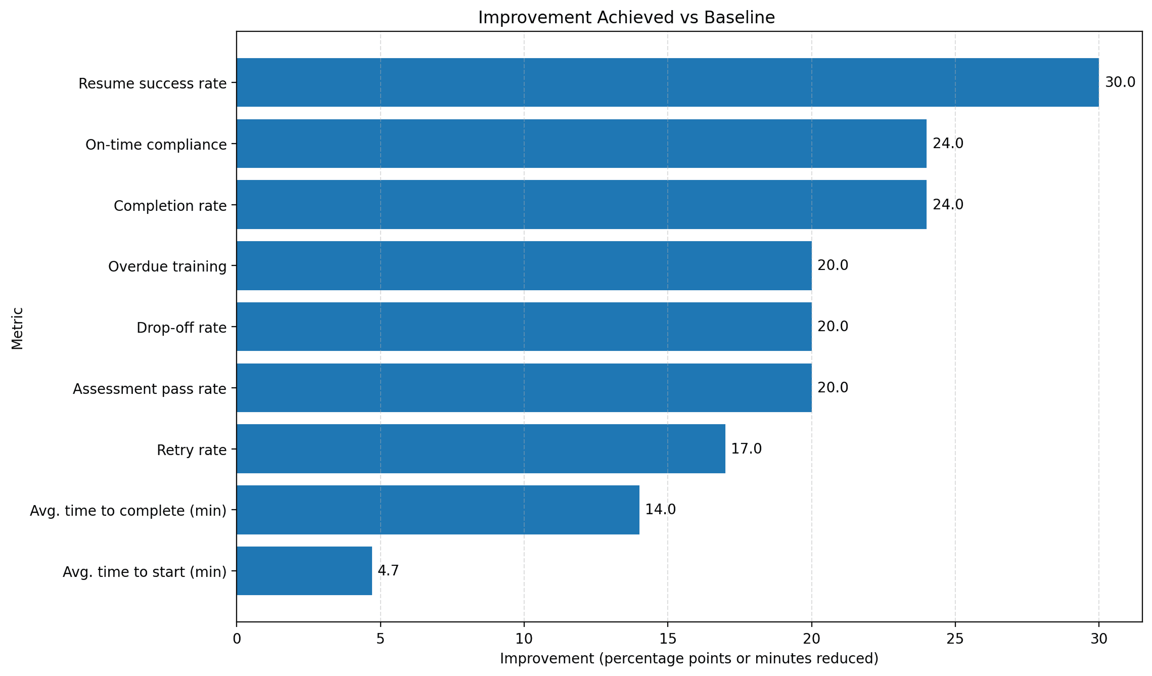
IMPACT/RESULTS
A streamlined redesign of the training experience (hypothetical analytics) reduced friction at key moments, starting, resuming, and finishing modules, resulting in faster completion and stronger training outcomes.
What this changed for users
Users were able to start training more quickly, return without losing progress, and finish with fewer restarts, thereby reducing frustration and improving confidence, especially for learners completing modules within short time windows.
Measurable outcomes
|
|
| ||||||
|
|
|
Usability Testing
To validate the redesign prior to wider rollout, I conducted a round of moderated usability testing with a representative sample of employees across both office and mine-site contexts.
The goal was to assess whether the redesign meaningfully addressed the friction points identified in research, specifically around discovery, mid-module engagement, and completion confidence.

SAP Enable Now Analytics Review
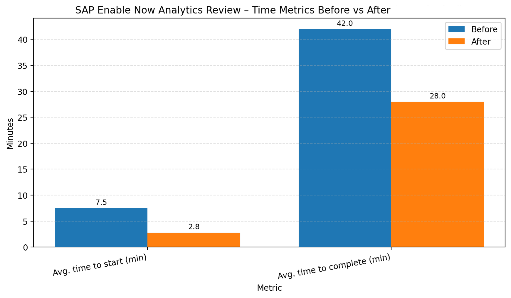
RESEARCH
The research aimed to uncover user needs, identify barriers to completion, and understand the environmental constraints shaping how employees engage with training, across both office and mine-site teams, in order to inform a simpler, faster, and more effective learning experience.
To achieve this, I employed a mixed-method research approach that combined direct user feedback, observed task behaviour, and operational data.
This allowed me to develop a well-rounded understanding of both the usability and reliability issues affecting the platform, as well as the compliance implications that followed from them.
Research Method | Purpose + Impact Supported | Actions Performed |
|---|---|---|
User Interviews (Employees) | Purpose: Understand real problems in completing training Impact Supported: completion, ease of use, retention, and low connectivity | Qualitative Research Ran 30–45 minute 1:1 interviews (in-person/Teams/phone) using a semi-structured question guide. Quantitative Research Sent a short 5–10 minute online survey to 50 employees across the office and mine sites. |
Usability Testing - SAP Enable Now (Current Platform) | Purpose: See where users struggle in the training flow Impact Supported: time-to-start, time-to-complete, ease of use, completion | Measured:
|
SAP Enable Now / Analytics Review | Purpose: Validate issues with real usage data Impact Supported: completion, compliance, time, retention | Reviewed:
|
Support Ticket / Admin Feedback Review | Purpose: Identify repeated problems and administrative burdens. Impact Supported: admin effort, operational cost, reliability | Looked for:
|
Content Review with SMEs (Modules + Assessments) | Purpose: Check if the training content is too long, unclear, or hard to follow Impact Supported: retention, competency, ease of use, completion | Reviewed:
|
User personas
Qualitative & Quantitative Research Questionnaires
User Journey
INSIGHTS
Key Findings
Across both qualitative interviews (n=10) and quantitative questionnaires (n=20), friction was present at nearly every stage of the learning journey.
The most reported pain points were slow loading (75%), progress not saving or resuming correctly (70%), and difficulty finding the right module (60%).
UX ratings were below average across all measures, with reliable save/resume scoring the lowest at 2.4 and motivation to complete at 2.6. Mid-module was identified as the most painful point in the journey, and mine-site employees consistently reported a worse experience than their office-based counterparts.
Opportunity Areas
Opportunity | Insight | Design Direction |
|---|---|---|
Fix reliability first | Save/resume and loading were the lowest-rated issues across both methods | Prioritise technical performance before interface changes |
Simplify module discovery | 60% of users struggled to find their required training | Surface role-relevant modules immediately, without navigation |
Reduce mid-module drop-off | The mid-module was the highest drop-off point in the journey | Shorter segments, clearer progress indicators, scannable layouts |
Design for the mine-site | Site employees faced compounded connectivity and device challenges | Build an experience that accounts for low-bandwidth and mobile constraints |
Close the loop on completion | Low scores on motivation and compliance confidence | Design a deliberate, affirming completion state |
DESIGN PROCESS
With research findings and usability insights in hand, I moved into ideation with a clear brief: design a learning experience that is immediate, reliable, and confidence-building for both office and mine-site employees.
Concepts Explored
Concept | Description | Progressed |
|---|---|---|
Personalised training dashboard | A role-based home screen surfacing only required modules, ordered by urgency | ✓ |
Persistent progress bar | A fixed, always-visible indicator of overall compliance completion across the platform | ✓ |
Offline mode for mine-site | Downloadable modules accessible without connectivity, syncing on reconnection | Partial - flagged for future sprint |
Micro-module format | Breaking long modules into short, completable segments with individual save points | ✓ |
Contextual save confirmation | A subtle, persistent indicator confirming progress has been saved after every interaction | ✓ |
Completion summary screen | A post-module screen summarising what was completed, with a compliance status confirmation | ✓ |
Gamified progress tracking | Badges and streaks to drive motivation and return visits | ✗ deprioritised as misaligned with compliance context |
Manager visibility dashboard | A view for team leads to monitor compliance status across their team | ✗ out of scope for this phase |
Wireframes
Designing for Accessibility
Accessibility improvements focused on readability, keyboard and screen reader support, clearer interactions, and low-connectivity resilience to create a more inclusive and reliable learning experience for both office and remote users.
Improvement | Why It Matters | Expected Impact |
|---|---|---|
Improve text readability (font size, contrast, spacing, shorter paragraphs) | Makes content easier to read and reduces fatigue | Better comprehension, less cognitive load, improved completion |
Clear heading structure (H1, H2, H3) | Helps users scan content and understand page structure | Faster navigation, better usability, stronger content clarity |
Clear action labels (e.g., Start Module, Continue Training) | Removes ambiguity and makes tasks easier to understand | Quicker decisions, better ease of use |
Screen reader-friendly labels (buttons, forms, status messages) | Ensures assistive tech users can understand and use the platform | Better accessibility for screen reader users |
Accessible assessments and forms | Makes quizzes easier to complete and reduces avoidable errors | Higher assessment completion, less frustration |
Clear error messages with guidance | Helps users recover quickly when something goes wrong | Fewer drop-offs, faster recovery from errors |
Plain language and consistent terminology | Improves understanding across different literacy/digital confidence levels | Better comprehension, easier learning experience |
Applying Psychological Principles
Psychological Principle | How Applied | UX Example | Expected Impact |
|---|---|---|---|
Goal-Gradient Effect | Made progress visible to motivate users to continue and finish | Progress bar, section count, milestone messages, time remaining | Higher completion rates, better engagement |
Cognitive Load Theory | Reduced mental effort by simplifying and chunking content | Shorter sections, clear headings, smaller content blocks, less clutter | Better comprehension, lower drop-off, improved retention |
Recognition Over Recall | Reduced memory load with familiar patterns and visible options | Clear labels (Start/Continue), consistent navigation, visible resume options | Faster task completion, fewer errors, better usability |
Feedback Loop Principle | Provided immediate system and learning feedback | “Progress saved” confirmation, loading states, quiz feedback, clear error messages | More confidence, less frustration, better learning outcomes |
SOLUTION
The redesign was shaped by established UX laws and principles. These principles helped guide decisions to simplify the learning journey, reduce cognitive load, improve familiarity and clarity, and make progress more visible throughout the experience.
As a result, the solution was designed to reduce friction, support reliable use in low-connectivity environments, enhance learning clarity, and improve training completion for both head office employees and remote site-based teams.
End-to-end Journey
Design Decisions
Screen: Navigation
Applied UX Law | Where Applied | UI Example | Expected Impact |
|---|---|---|---|
Hick’s Law | Dashboard and training home | Prioritised required training and reduced competing options | Faster decisions, quicker start, improved completion |
Miller’s Law | Module content structure | Broke long content into smaller sections (microlearning) | Reduced cognitive load, better retention |
Serial Position Effect | Learning content structure | Key messages placed at section starts and summaries | Improved recall of important information |
Screen: Start
Applied UX Law | Where Applied | UI Example | Expected Impact |
|---|---|---|---|
Progressive Disclosure | Content and help information | Showed only key content first, with extra details on demand | Cleaner screens, less overwhelm |
Aesthetic–Usability Effect | Visual design and layout | Clear hierarchy, consistent spacing, readable typography | Better perceived usability, higher confidence |
Screen: Start Module
Screen: Start Demo
UX Law | Where Applied | UI Example | Expected Impact |
|---|---|---|---|
Jakob’s Law | Module navigation and overall flow | Familiar labels and patterns (Start, Continue, Next, Submit) | Lower learning curve, improved ease of use |
Screen: Content
UX Law | Where Applied | UI Example | Expected Impact |
|---|---|---|---|
Aesthetic–Usability Effect | Visual design and layout | Clear hierarchy, consistent spacing, readable typography | Better perceived usability, higher confidence |
Screen: Content
Screen: Completion
UX Law | Where Applied | UI Example | Expected Impact |
|---|---|---|---|
Doherty Threshold | Performance and feedback states | Lightweight pages, loading indicators, quick save feedback | Better engagement, fewer drop-offs |
Peak-End Rule | Assessment and completion moments | Clear completion confirmation, summary, and next steps | Better final impression, stronger confidence |
IMPACT/RESULTS
A streamlined redesign of the training experience (hypothetical analytics) reduced friction at key moments, starting, resuming, and finishing modules, resulting in faster completion and stronger training outcomes.
What this changed for users
Users were able to start training more quickly, return without losing progress, and finish with fewer restarts, thereby reducing frustration and improving confidence, especially for learners completing modules within short time windows.
Measurable outcomes
|
|
| ||||||
|
|
|
Usability Testing
To validate the redesign prior to wider rollout, I conducted a round of moderated usability testing with a representative sample of employees across both office and mine-site contexts.
The goal was to assess whether the redesign meaningfully addressed the friction points identified in research, specifically around discovery, mid-module engagement, and completion confidence.
SAP Enable Now Analytics Review
NEXT STEPS
The next phase of the project would focus on further improving the experience for mine site and remote users, particularly in low-connectivity environments where load performance and save/resume reliability remain more challenging. This would include refining offline-friendly access, reducing remaining friction in login and session recovery, and continuing to optimise performance across shared and mobile devices.
Further usability testing and analytics review would help validate ongoing improvements, identify remaining pain points, and support continuous enhancement of learning clarity, accessibility, and completion outcomes across both office and site-based teams.
KEY TAKEAWAYS
Designing for context is essential, especially in time-poor and low-connectivity environments.
Reducing friction across start, resume, and completion points can significantly improve engagement and compliance.
Simplifying content and navigation improves clarity, usability, and learning confidence.
Performance optimisation is a critical part of user experience, not only a technical consideration.
Data-informed design decisions can translate directly into measurable user and business outcomes.
INDUSTRY
Mining
PLATFORM
SAP Enable Now
Other projects
Other projects
Interested in connecting?
prasadigunathillake@gmail.com
Interested in connecting?
prasadigunathillake@gmail.com
Copyright 2026 by Prasadi Gunathillake
Copyright 2026 by Prasadi Gunathillake
Copyright 2026 by Prasadi Gunathillake